All CSS Viewport Units (svh lvh svw lvw dvh dvw) Explained
In CSS, the viewport is the area of the browser window that is used to display the webpage. The size of the viewport can be affected by the size of the device being used to view the webpage, as well as the zoom level. The vh and vw units are often used to create responsive designs that adjust the layout based on the size of the viewport.
However with the recent browsers support of small, large and dynamic CSS viewport, there are several useful units introduced such as lvh , svh , dvw . We’ll talk about them in this post.
Problem with vw and vh
When browsing web on mobile devices, browsers tend to hide/expend UI like address bar to provide maximum viewable area. This causes problem with default viewports unit such as vh and vw. For example, 100vh might not include the height of the address bar while some browsers might do.
By introducing specific viewport units, web developers can now choose to design which type of viewport percentage units to work on.
Small, Large and Dynamic Viewports
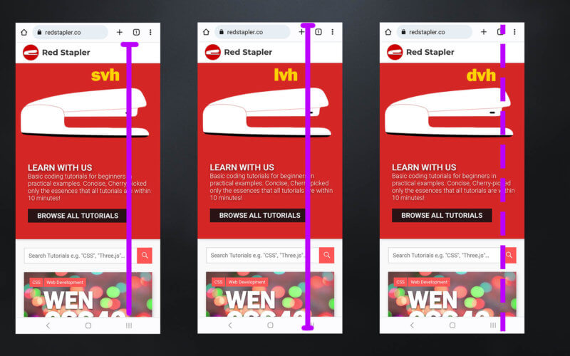
Small viewport is the smallest possible viewport size when all browser’s expandable UI are expanded. The CSS units for small viewport start with sv*
- svh
- svw
Below is the definition of small viewport from W3C
The small viewport-percentage units (sv*) are defined with respect to the small viewport size: the viewport sized assuming any UA interfaces that are dynamically expanded and retracted to be expanded. This allows authors to size content such that it can fit within the viewport even when such interfaces are present, noting that such content might not fill the viewport when such interfaces are retracted.
Example: Designing with 100% svh means that no content will be obscured by browsers UI when expanded. However, the design might show some blank space when some UI (ex. address bar) is hidden
Large viewport is the largest possible viewport size when all browser’s expandable UI are hidden. The CSS units for small viewport start with lv*
- lvh
- lvw
Below is the definition of large viewport from W3C
The large viewport-percentage units (lv*) are defined with respect to the large viewport size: the viewport sized assuming any UA interfaces that are dynamically expanded and retracted to be retracted. This allows authors to size content such that it is guaranteed to fill the viewport, noting that such content might be hidden behind such interfaces when they are expanded.
Example: Designing with 100% lvh means content will fit the viewport perfectly when browsers UI is hidden. However, the content will be obscured when address bar is expanded
Dynamic viewport is the current viewport size based on current browser’s expandable UI state. The CSS units for small viewport start with dv*
- dvh
- dvw
Below is the definition of dynamic viewport from W3C
The dynamic viewport-percentage units (dv*) are defined with respect to the dynamic viewport size: the viewport sized with dynamic consideration of any UA interfaces that are dynamically expanded and retracted. This allows authors to size content such that it can exactly fit within the viewport whether or not such interfaces are present.
When using dynamic viewport units, the size will be automatically adjusted in response to browser UI state (expanding, hiding)
So which one to use?
Personally I prefer small viewport units as it “safer” in general that all of content will be displayed (But will need to deal with the UI gap later) But if you are designing for maximum available display area and wouldn’t mind if some content are temporary obscured, then large viewport units are your choice.
As for dynamic viewport, I find it rather difficult to use as the content will always be automatically resize (For example, from user scrolling a page or browser UI state changes)
It’s worth noting that there are also other viewport units such as vmin (the smaller of the viewport width or height), and vmax (the larger of the viewport width or height). These units can be useful for creating responsive designs that adjust to different viewport sizes.
That’s all for this post. If you like it, check out our YouTube channel and our Facebook page to stay tune for more dev tips and tutorials 🙂
