
How to Add Loading Animation to Website in 2 Minutes
In this tutorial, I’m going to show you how to add a loading animation to your website and remove it when everything is loaded. Let’s check it out! (All source code at the end of this post)
Simulate Loading Delay
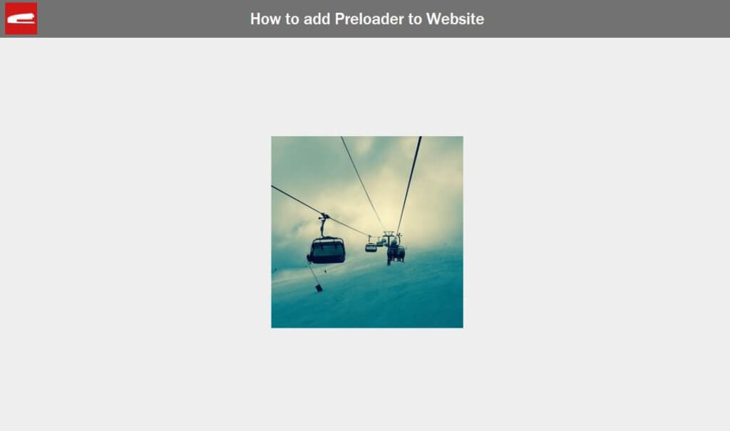
So our example page have just a div with an image. But this is not just a regular image. It’s a random image from external source (picsum.photos) that change every time you refresh. This is to prevent the browser from caching it so we can simulate the loading time on local server.
<div class="content">
     <img src="https://picsum.photos/300/300/?random" />
</div>
Loading Animation
And here is loader I found on codepen that I want to add to my website.
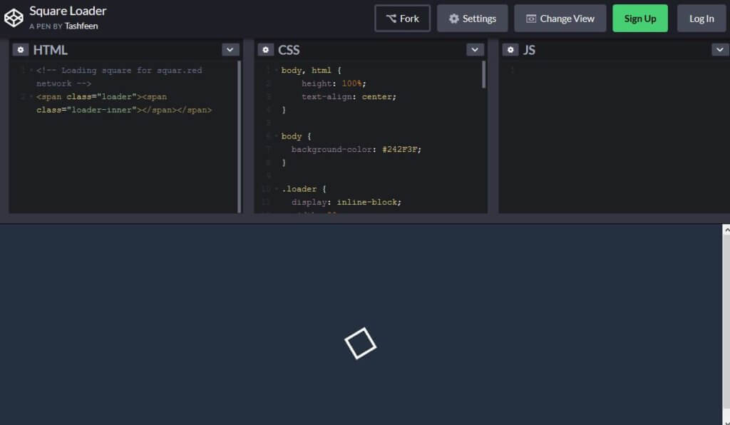
I’m going to copy over the code for both HTML and CSS and then create a wrapper around it. (Full source code below)
<div class="loader-wrapper">
    <span class="loader"><span class="loader-inner"></span></span>
</div>
.loader-wrapper {
  width: 100%;
  height: 100%;
  position: absolute;
  top: 0;
  left: 0;
  background-color: #242f3f;
  display:flex;
  justify-content: center;
  align-items: center;
}
I want to loader to cover the entire page when it’s loading, so I’ll set the width and height to 100%. then set the position to absolute and zero top/left. Also add background color as well.
.loader {
  display: inline-block;
  width: 30px;
  height: 30px;
  position: relative;
  top: 50%;                       /******** <- Remove this line *********/
  border: 4px solid #Fff;
  animation: loader 2s infinite ease;
}
The original code use 50% top to center the loader. I’ll remove it and use flex layout to center the cube loader instead.
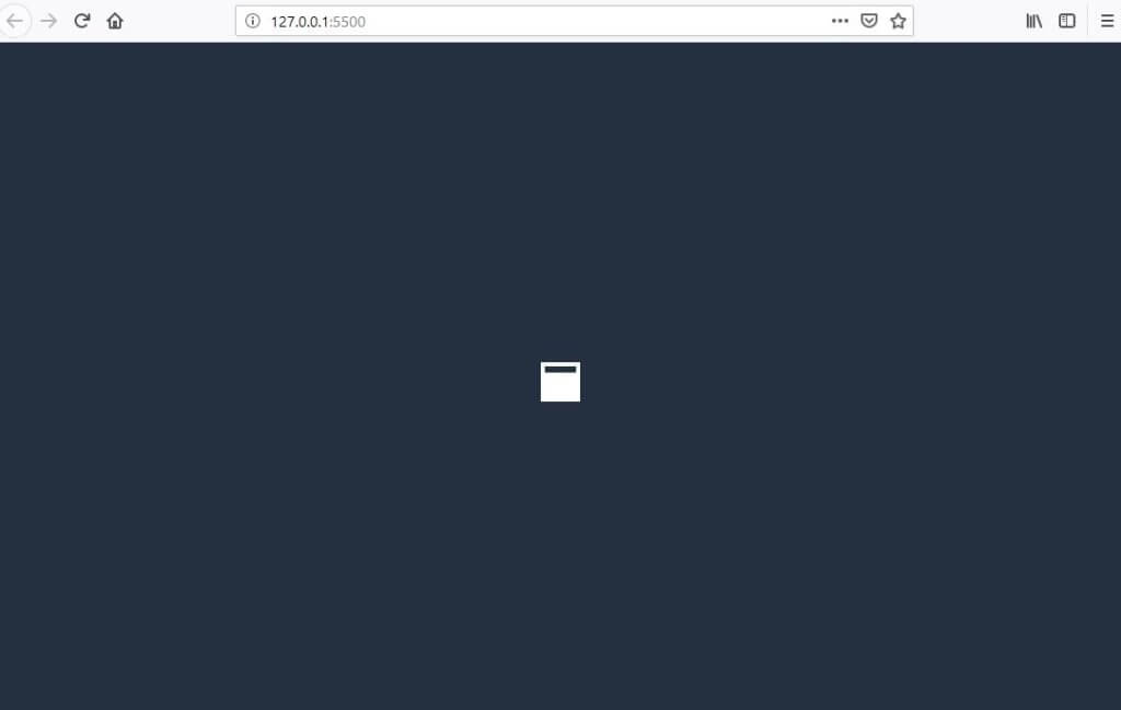
Load Event
The loading Animation is ready. Next we’ll need hide it when the loading is complete. We can do that by listening to window load event which will trigger when all the elements have been completely loaded. Then use jQuery fadeOut method to hide the loader.
$(window).on("load",function(){
     $(".loader-wrapper").fadeOut("slow");
});
And that’s it! Very simple and straightforward. See the result in the video below.
Hope it helps! Also don’t forget to subscribe our Youtube Channel or follow us on Facebook to stay tune for more tutorial like this. Bye 
Full Source Code
HTML
<!DOCTYPE html>
<html>
  <head>
    <meta http-equiv="content-type" content="text/html; charset=UTF-8" />
    <script src="jquery-2.1.4.js"></script>
    <link rel="stylesheet" type="text/css" href="styles.css" />
  </head>
  <body>
    <div class="content">
      <img src="https://picsum.photos/300/300/?random" />
    </div>

    <div class="loader-wrapper">
      <span class="loader"><span class="loader-inner"></span></span>
    </div>

    <script>
        $(window).on("load",function(){
          $(".loader-wrapper").fadeOut("slow");
        });
    </script>
  </body>
</html>
CSS
body {
  margin: 0;
  padding: 0;
  width:100vw;
  height: 100vh;
  background-color: #eee;
}
.content {
  display: flex;
  justify-content: center;
  align-items: center;
  width:100%;
  height:100%;
}
.loader-wrapper {
  width: 100%;
  height: 100%;
  position: absolute;
  top: 0;
  left: 0;
  background-color: #242f3f;
  display:flex;
  justify-content: center;
  align-items: center;
}
.loader {
  display: inline-block;
  width: 30px;
  height: 30px;
  position: relative;
  border: 4px solid #Fff;
  animation: loader 2s infinite ease;
}
.loader-inner {
  vertical-align: top;
  display: inline-block;
  width: 100%;
  background-color: #fff;
  animation: loader-inner 2s infinite ease-in;
}

@keyframes loader {
  0% { transform: rotate(0deg);}
  25% { transform: rotate(180deg);}
  50% { transform: rotate(180deg);}
  75% { transform: rotate(360deg);}
  100% { transform: rotate(360deg);}
}

@keyframes loader-inner {
  0% { height: 0%;}
  25% { height: 0%;}
  50% { height: 100%;}
  75% { height: 100%;}
  100% { height: 0%;}
}
Wow you are really Genius… I learn so many things from here and your YouTube channel.. thnaks a lot
I’ll create a 3D cube animation in my site. Thank you.
Hey!! I can’t add this on my website.I also copied your code and paste this but it is not working.
Thanks, thanks for example, easy to understand
Nice it’s working..
Hi
Great Content