
3D Infinity Effect CSS Tutorial
In this tutorial, we’re going to show you how to create a 3D infinity effect using only CSS transform and CSS filter.
The HTML
So first let’s start with HTML structure. I’m going to create a container. Then create a child div and assign a frame class to it. And that’s all for now. Let’s work on the CSS.
<div class="container">
  <div class="frame"></div>
</div>
The CSS
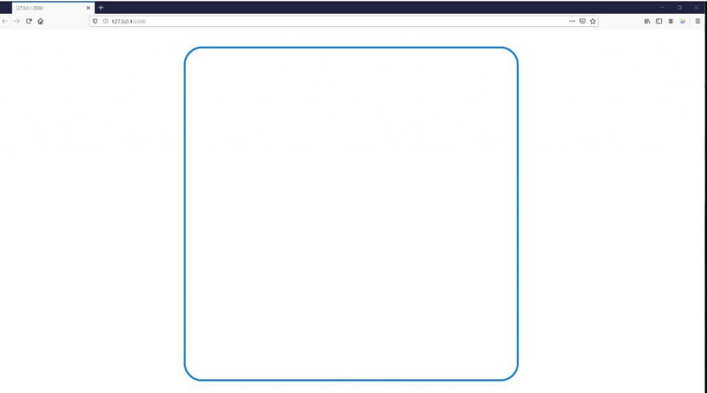
I’m going to set the width and height of the container to 100% and set position to relative. Then set the layout to flex display to center every child element. For the frame div, I’m going to set the size to 900px square. Then set the position to absolute, border-radius and light blue solid border.
.container {
  width:100%;
  height: 100%;
  position: relative;
  display: flex;
  align-items: center;
  justify-content: center;
}
.frame {
  width: 900px;
  height: 900px;
  position: absolute;
  border-radius: 50px;
  border: 5px #087be6 solid;
}
Now you should see a round square in the middle of the screen.
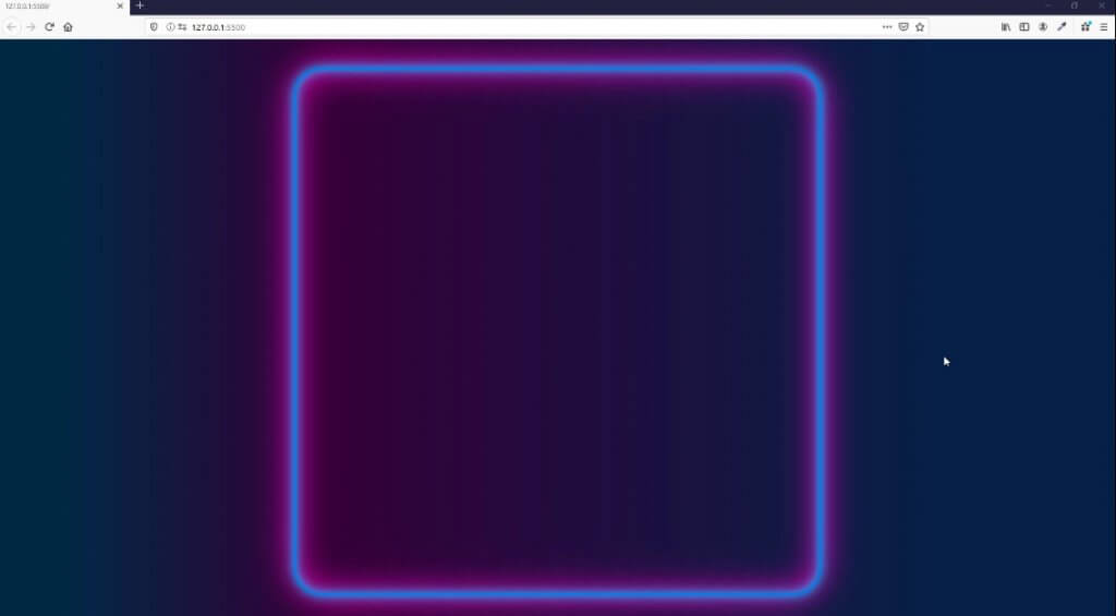
Next, I’m going to use a CSS gradient generator tool to generate the background color. I will create linear gradient using dark blue and dark purple. Then copy code to our CSS file and place it in the body element.
body {
  ...
  background: linear-gradient(90deg, rgba(0,41,69,1) 6%, rgb(53, 0, 56) 29%, rgba(7,33,71,1) 84%);
}
Then I’m going to add box-shadow to the frame element. First set of the shadow I’ll use 2 layers of light blue. One for outside and one for inside (inset). Then repeat the code to create another set. This time I’ll use light purple color with more blur distance.
.frame {
...
  box-shadow:
  0px 0px 20px #00ccff,
  inset 0px 0px 20px #00ccff,
  0px 0px 60px #ff00c8,
  inset 0px 0px 60px #ff00c8;
}
And here is the result. Starting to look good.
Next I’m going to add more frames to the container, you can add as many as you like.
<div class="container">
  <div class="frame"></div>
  <div class="frame"></div>
  <div class="frame"></div>
  <div class="frame"></div>
  <div class="frame"></div>
  <div class="frame"></div>
  <div class="frame"></div>
  <div class="frame"></div>
  <div class="frame"></div>
  <div class="frame"></div>
  <div class="frame"></div>
  <div class="frame"></div>
  <div class="frame"></div>
  <div class="frame"></div>
</div>
Then in the CSS. I’m going to use nth child selector to select each of them. We’re going to add a transform property to rotate them 40 degrees and then gradually increase translateY and decrease translateZ and opacity (repeat the code to match the number of the frame element you added.)
Note: Sass is a perfect way to write a redundant CSS rules like this.
.frame:nth-child(1) {
  transform: rotate(40deg) translateY(0px) translateZ(0px);
  opacity: 1.00;
  animation-delay: 0.1s;
}
.frame:nth-child(2) {
  transform: rotate(40deg) translateY(50px) translateZ(-10px);
  opacity: 0.9;
  animation-delay: 0.3s;
}
.frame:nth-child(3) {
  transform: rotate(40deg) translateY(100px) translateZ(-20px);
  opacity: 0.85;
  animation-delay: 0.5s;
}
...
Here is the result
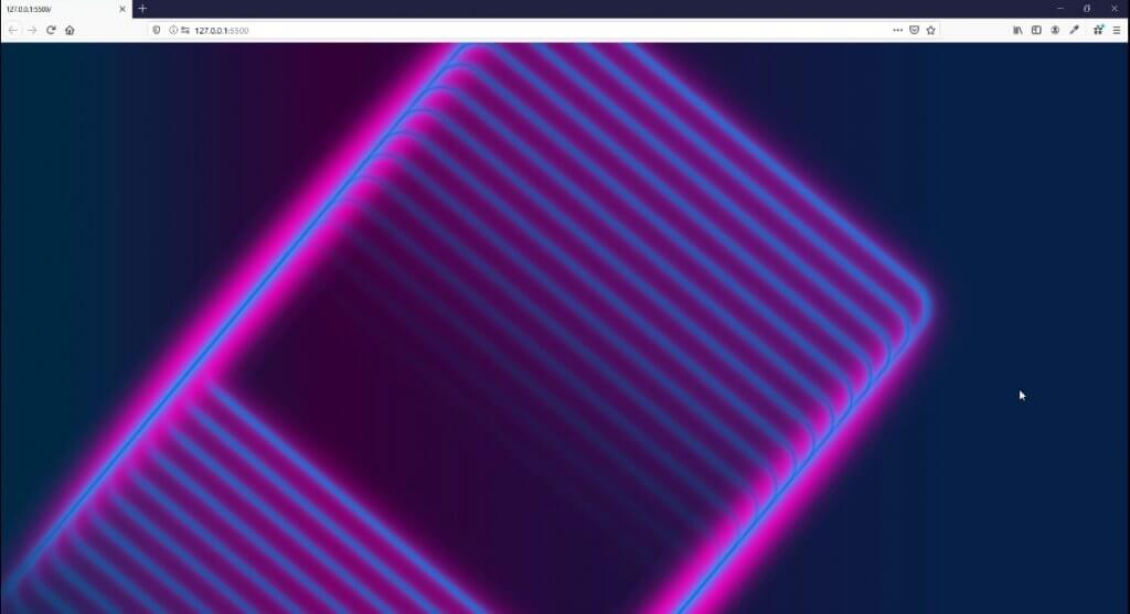
The reason it’s a mess is because we haven’t set the prespective property of the container. So the browser try to render our transform as 2D. I’ll add 50 pixel perspective and also add CSS filter to increase the brightness and contrast of the shadow for aesthetic.
.container {
...
  perspective: 50px;
}
.frame {
...
  filter:brightness(1.5) contrast(3);
}
And here is the result.
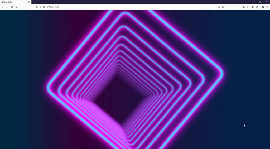
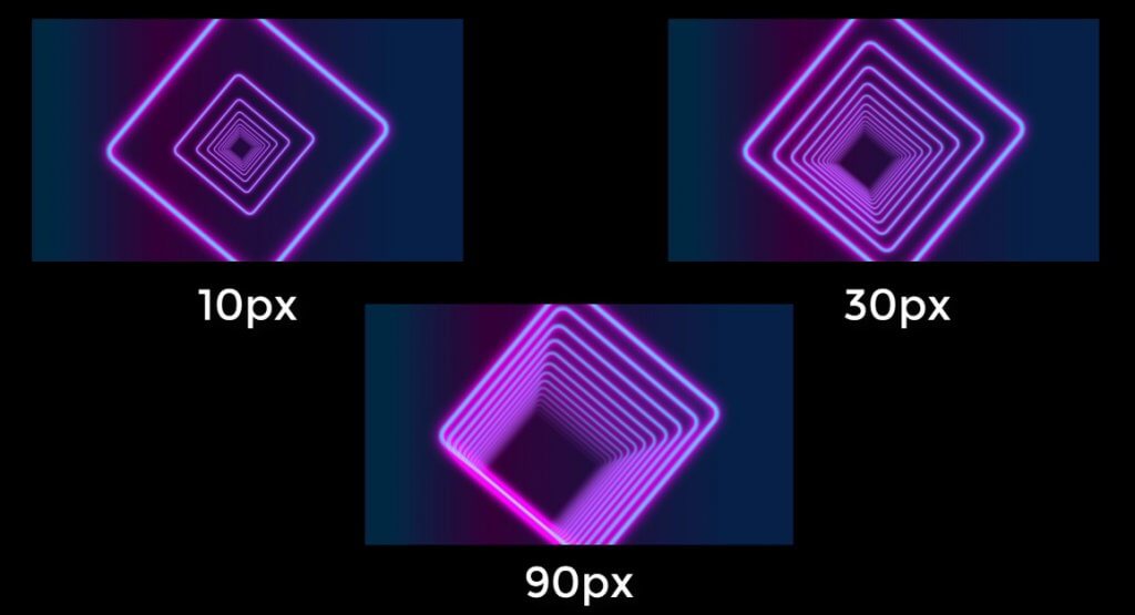
You can try changing the perspective amount to experiment with different viewing angle.
The Animation
Now the final step is to add the glowing and zooming animation. First create keyframes to animate brightness and contrast of each frame and perspective of the container.
@keyframes breathing {
  0% {filter: brightness(1.5) contrast(3);}
  50% {filter: brightness(1.1) contrast(2);}
  100% {filter: brightness(1.5) contrast(3);}
}
@keyframes zooming {
  0% {perspective: 45px;}
  50% {perspective: 50px;}
  100% {perspective: 45px;}
}
Then apply the animation
.container {
...
  animation: zooming 10s ease-in-out infinite;
}
.frame {
...
  animation: breathing 3s ease-out infinite;
}
The trick is to add the animation-delay to each of them and gradually increase the delay
.frame:nth-child(1) {
...
  animation-delay: 0.1s;
}
.frame:nth-child(2) {
...
  animation-delay: 0.3s;
}
.frame:nth-child(3) {
...
  animation-delay: 0.5s;
}
...
You can download source code of this project here or see the live demo in video below
If you want to see more web development tips and tutorials, don’t forget to subscribe our channel to stay tune for weekly update
