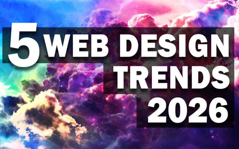
5 Web Design Trends That Will Define 2026
Just a few years ago, we were obsessed with minimalism and flat design. But as we move into 2026, the web design trend is becoming less about static pages and more about “living” experiences.
This year, the focus is shifting toward interfaces that feel physical, responsive, and deeply immersive. From typography that reacts to your presence to layouts inspired by Japanese lunchbox, the goal is to make the web feel less like a document and more like a conversation.
If you are looking to refresh your site or stay ahead of the curve, here are the five major trends dominating web design in 2026. (Click at the image for link to the source websites)
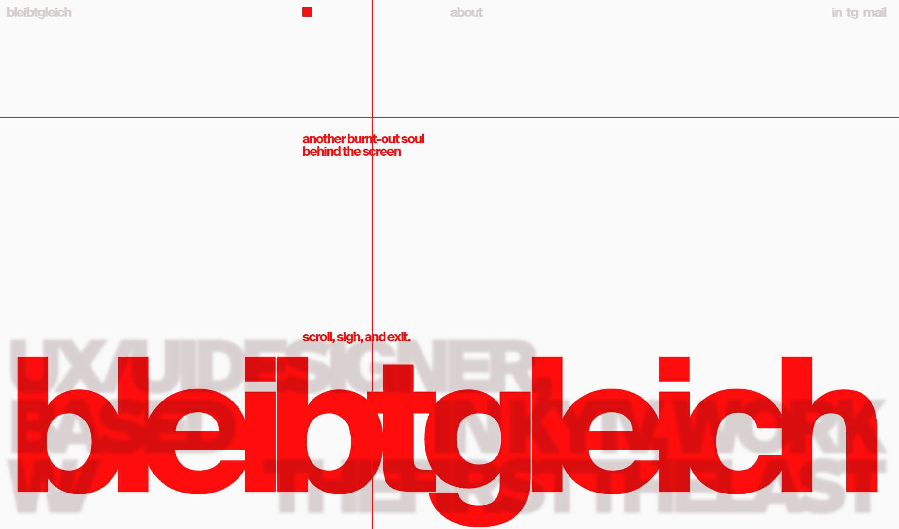
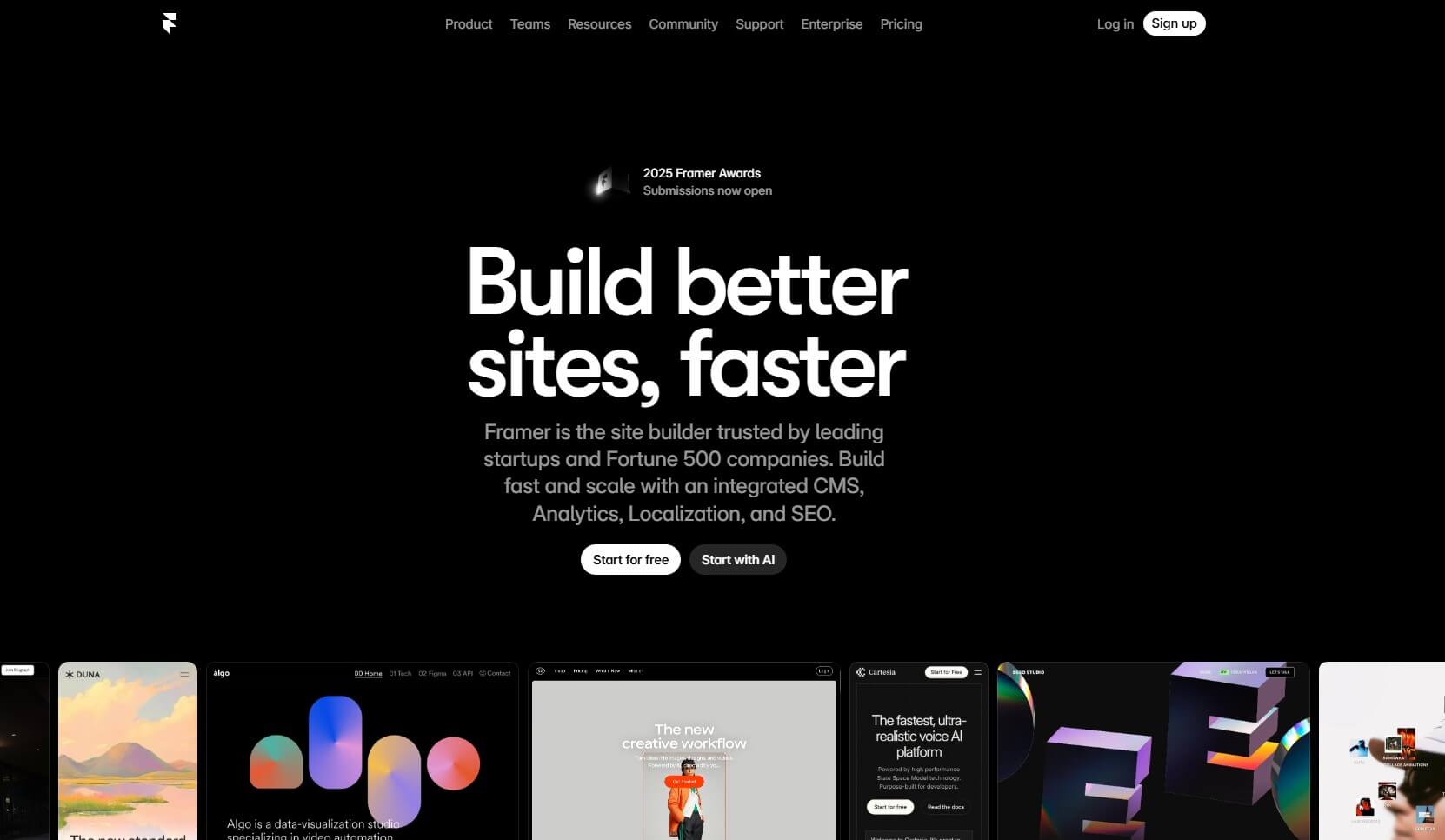
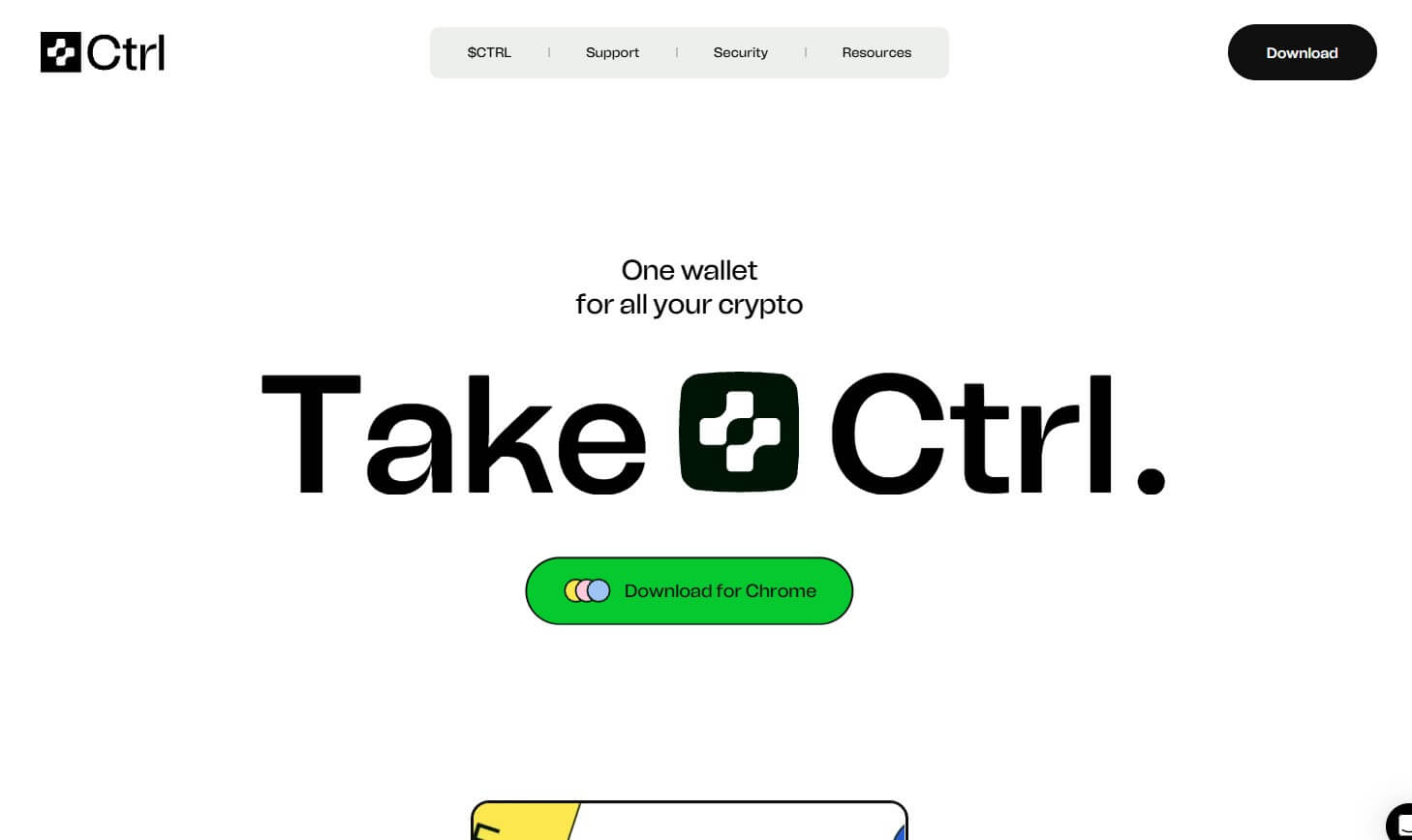
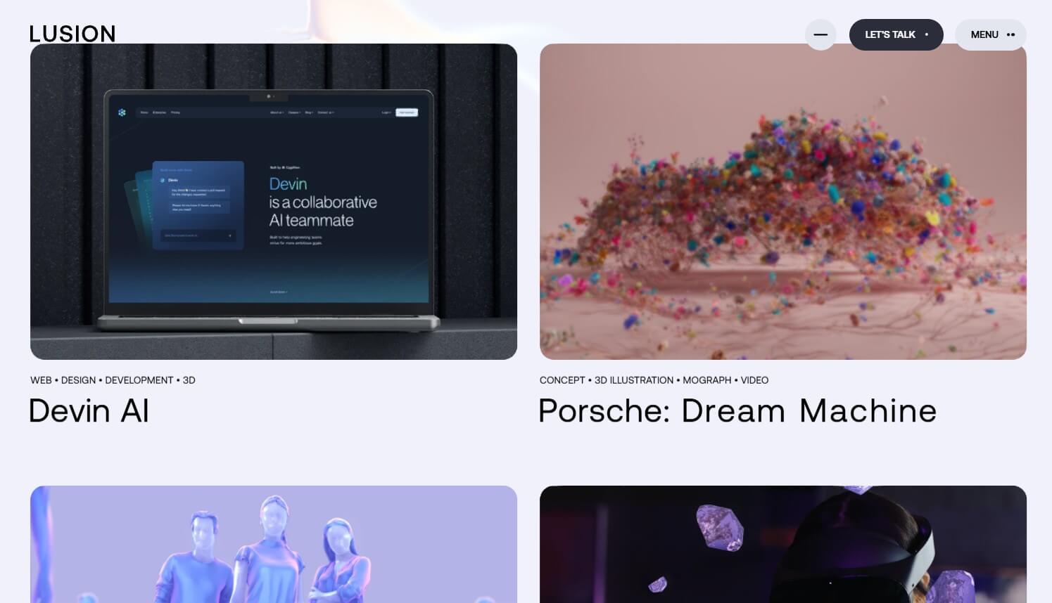
1. Kinetic Typography
Gone are the days when text just sat on a page. Kinetic Typography treats words as living objects—they stretch, shrink, and dance as you interact with them.
Rather than remaining static, text in 2026 responds to the user. As you scroll, headlines might gain weight to command attention, or letters might lean away from your cursor as if they have physical mass. This transforms a website from a passive reading experience into an active dialogue. Designers are using these animations not just for flair, but to intuitively guide users toward key information.
However, balance is key! Moving text is exciting, but it must never hinder readability. The best implementations keep the experience legible while adding a layer of responsiveness that feels premium.
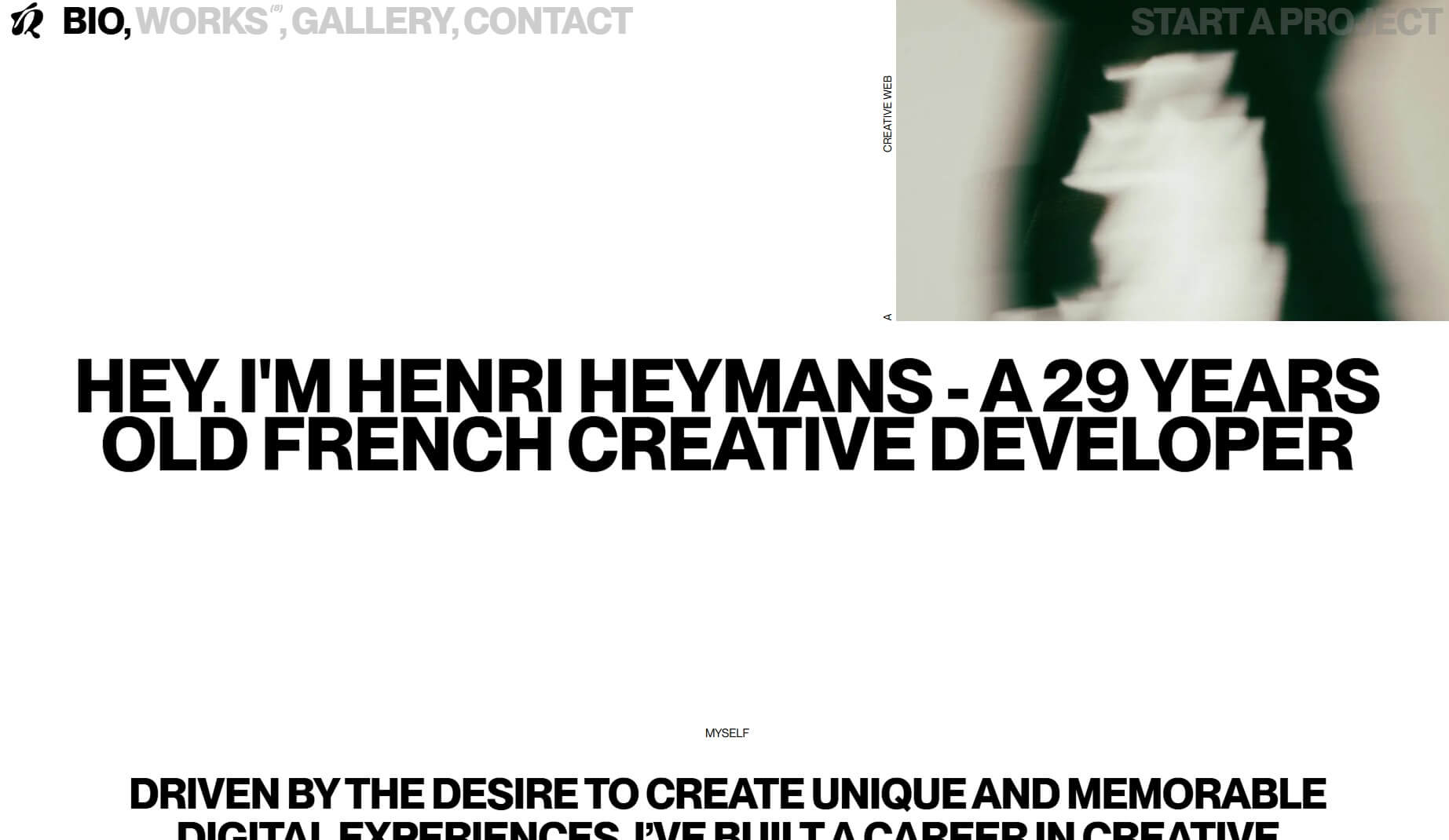
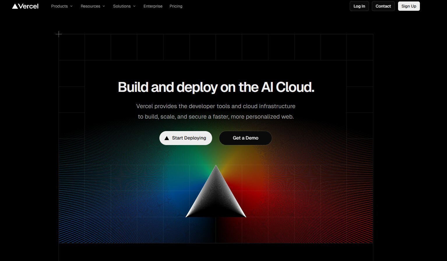
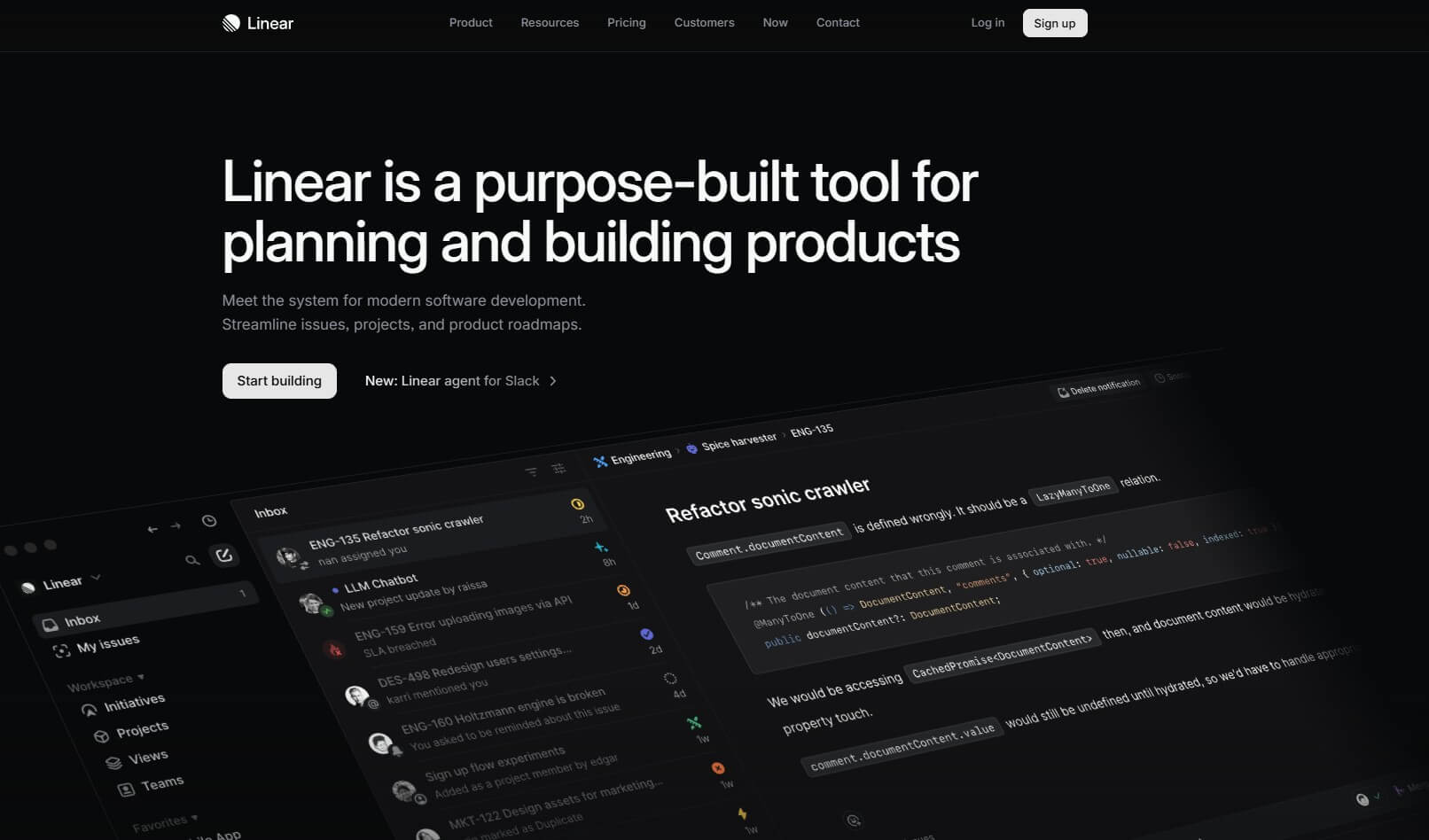
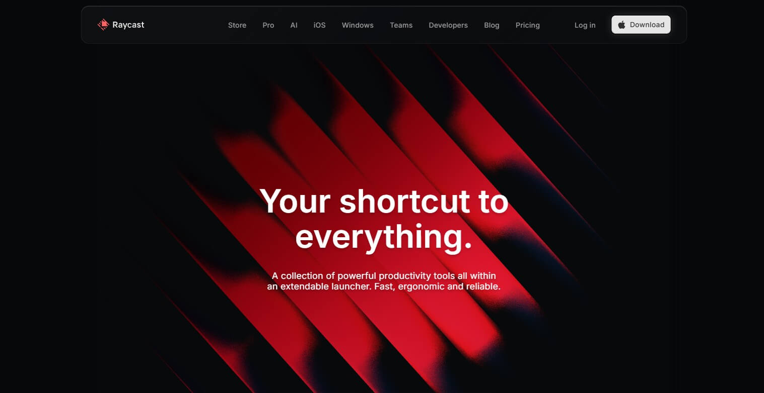
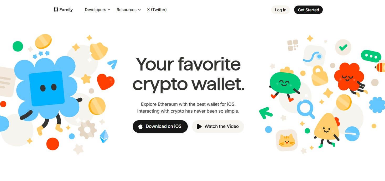
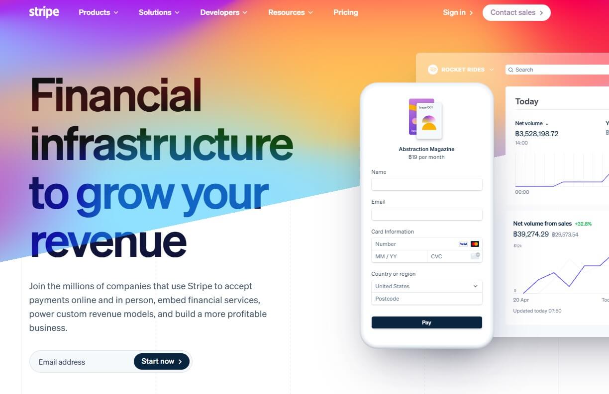
2. Dark Mode by Default
For years, Dark Mode was a “must-have” toggle settings for website. But in 2026, it is going away! (For a good reason)
Data has shown a clear pattern: once users switch to dark mode, they rarely switch back. It reduces eye strain and saves battery life on screens, creating a persistent preference for darker interfaces. Recognizing this, many brands are now launching with a “Dark-Only” or “Dark-Mode Default” strategy.
By removing the need to maintain a separate light theme, designers can focus all their resources on perfecting a single, sophisticated dark aesthetic that feels modern and immersive from the moment the page loads. Additionally, this also remove the need of maintaining code for two separate visual themes.
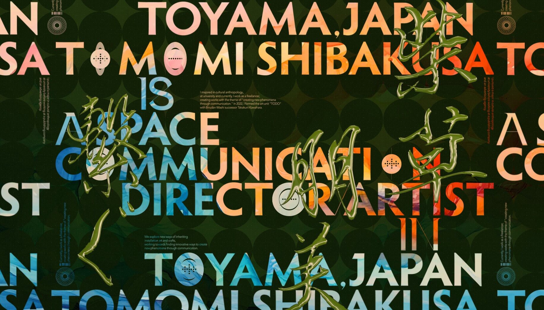
3. Cinematic Scrollytelling
Don’t let the name fool you—Cinematic Scrollytelling isn’t just about playing videos. It is about controlling the pacing and narrative of a website through the act of scrolling.
This trend turns a standard webpage into a sequential story. As the user scrolls, the interface prioritizes visual hierarchy, revealing headlines and supporting details in a structured, unfolding rhythm. It often utilizes:
- Scroll-triggered animations: Visuals that evolve as you move down the page.
- Parallax effects: Backgrounds moving slower than foregrounds to create 3D depth.
- Immersive environments: Using frameworks like Three.js to build depth.
The result is a controlled flow of information that keeps users curious, rewarding every scroll with a new visual reveal

4. Micro-Delight
If 2025 was about functionality, 2026 is about feeling. Micro-Delight refers to the subtle, advanced animations that occur during small interactions, turning static pages into “living” interfaces.
Think of a confetti burst when you click a “Subscribe” button, a playful wiggle when you hover over an image, or background colors that shift softly with your mouse movement. These aren’t massive, flashy intros; they are tiny, tactile moments that make the website feel responsive and physical.
The keys are performance and subtlety. These animations must be seamless and instant. If they are too many or delay the user’s action even by a second, they become an annoyance. When done right, they make a site feel polished and high-end.
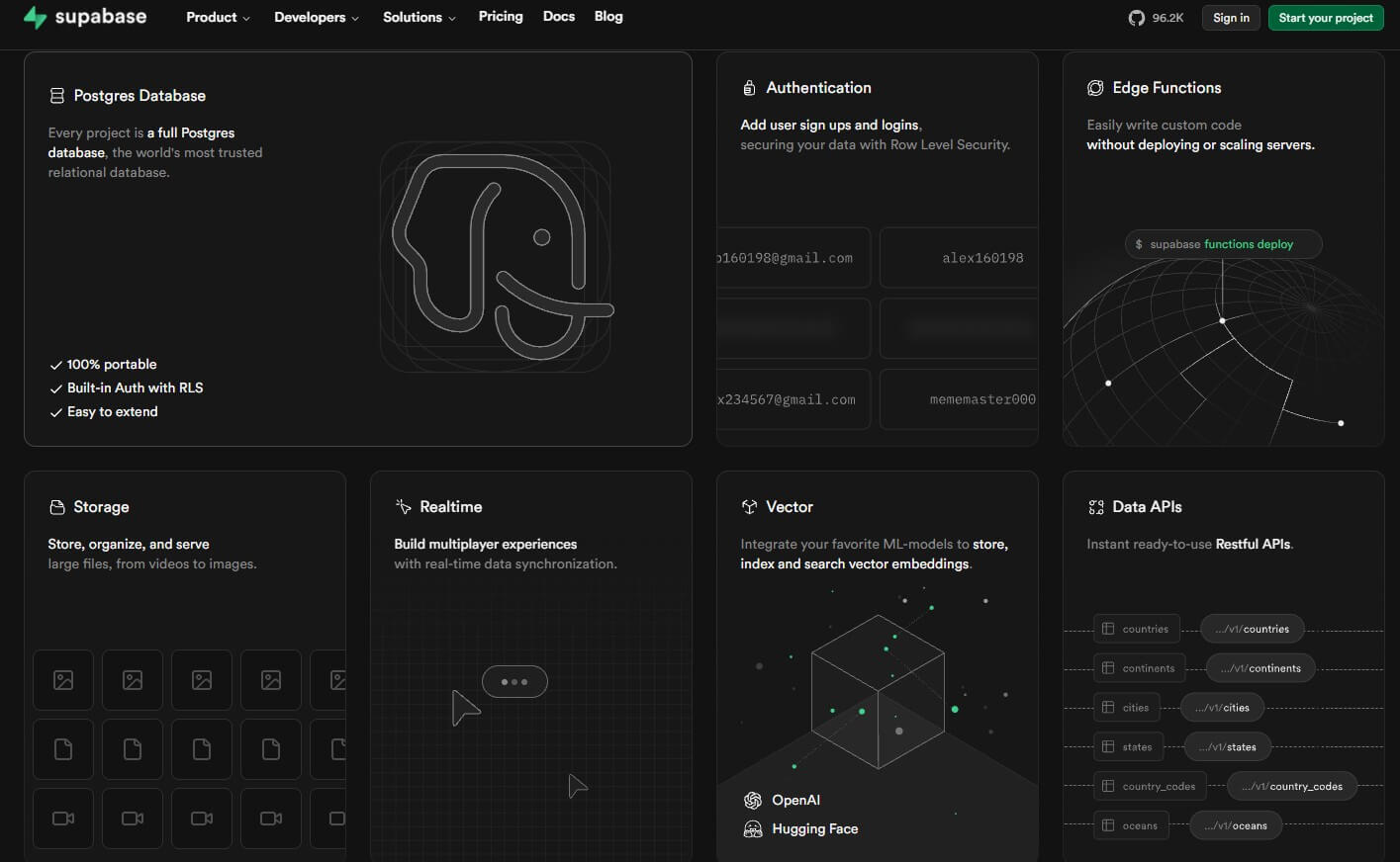
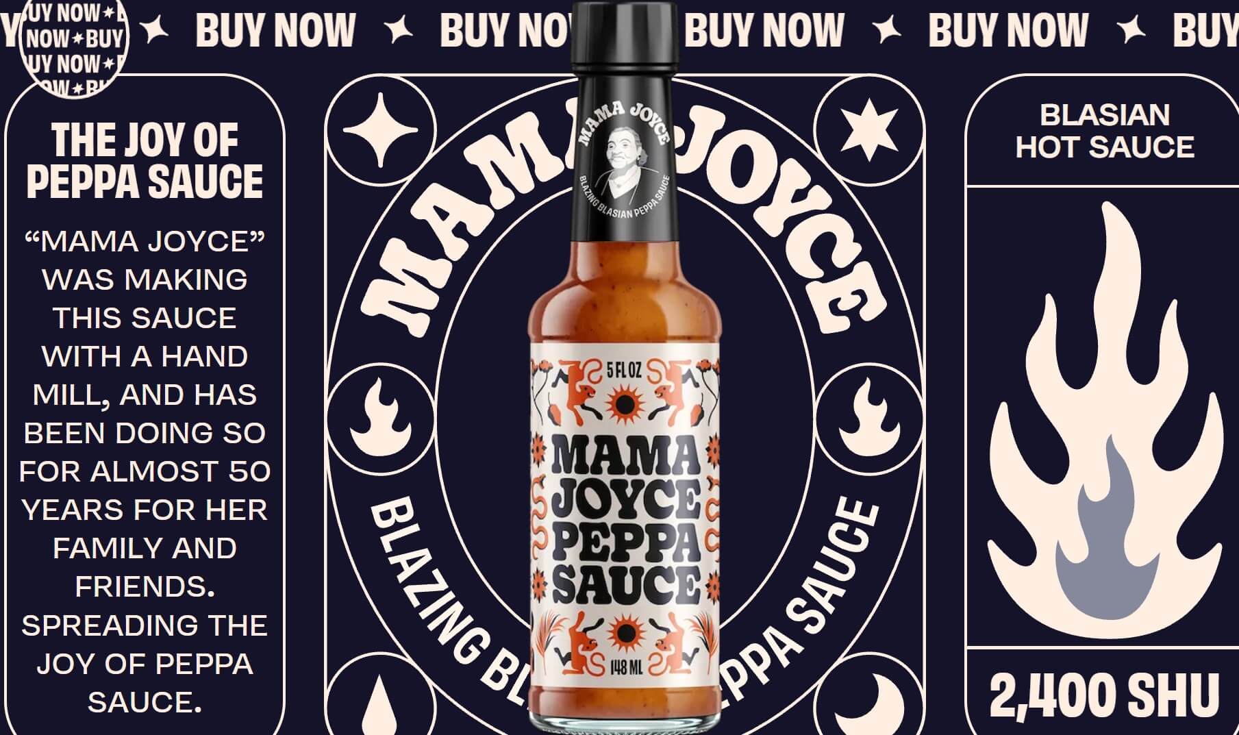
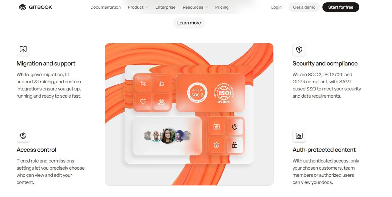
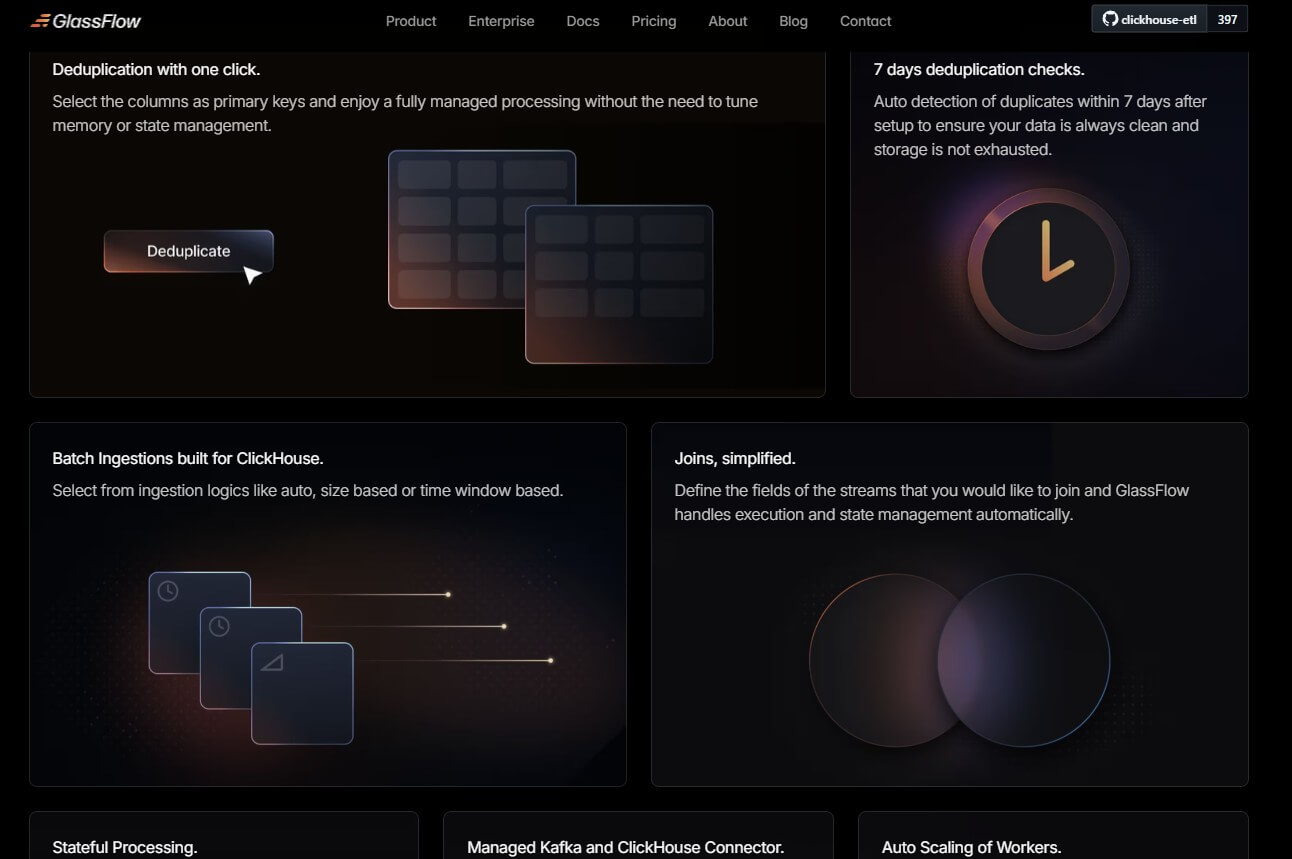
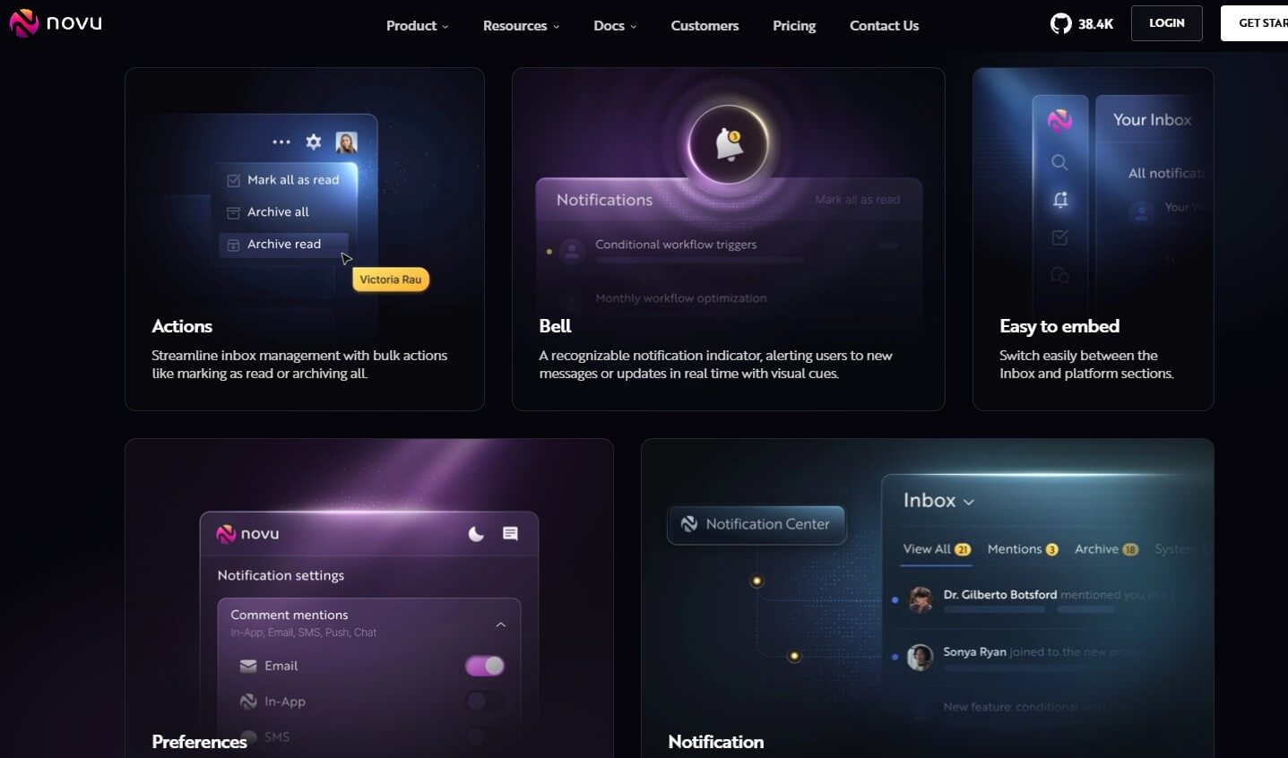
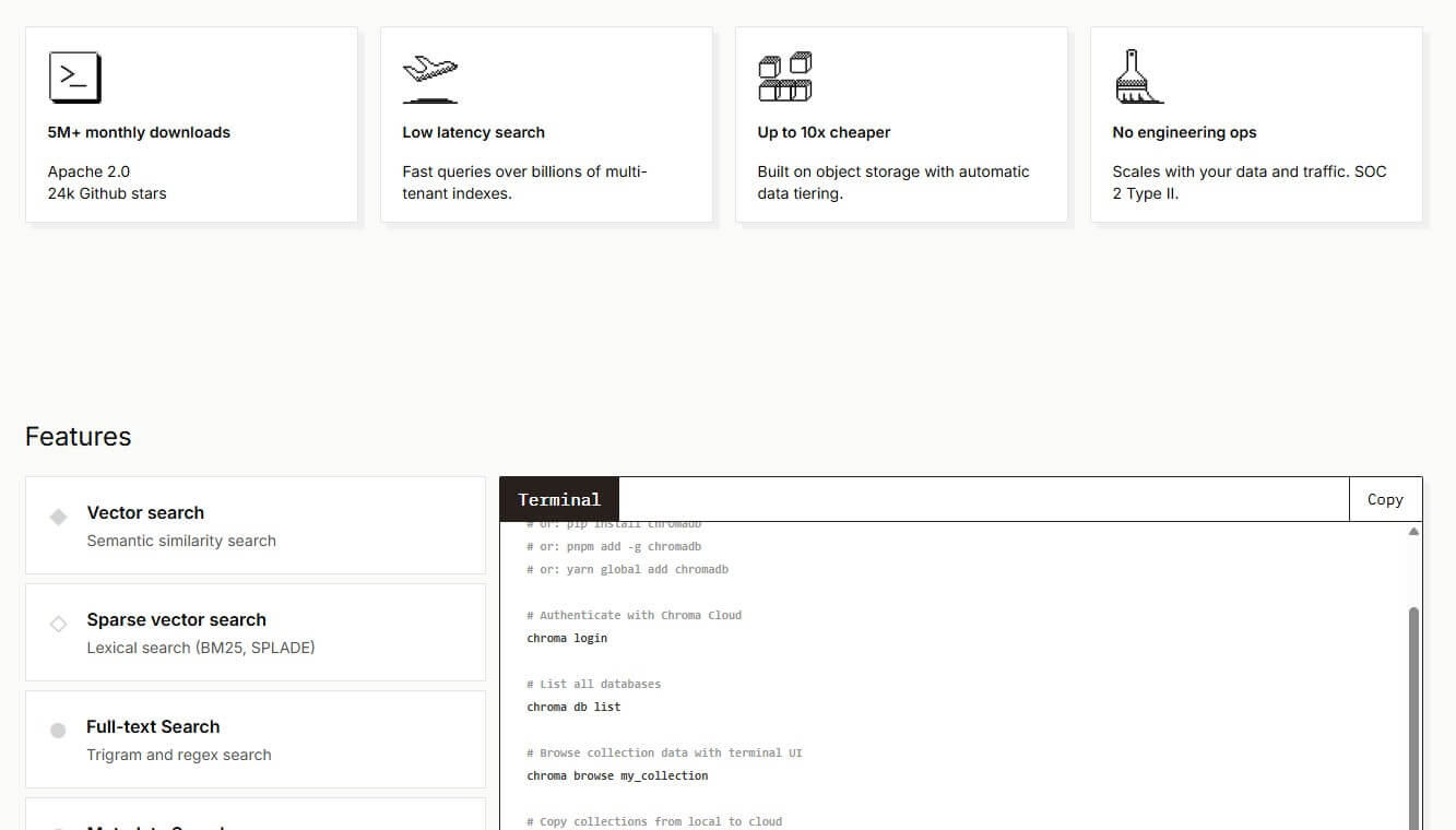
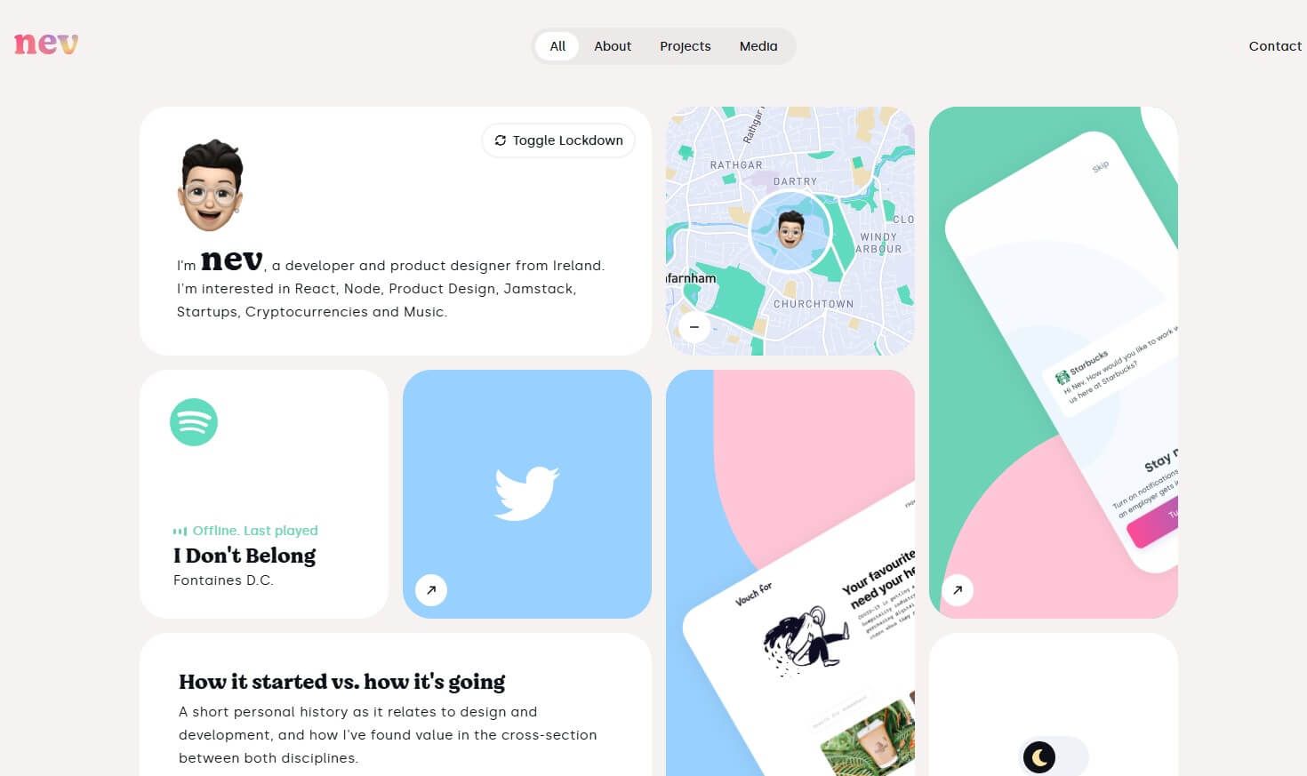
5. Bento Grids
Inspired by the organized compartments of a Japanese lunchbox, Bento Grids have graduated from tech dashboards to become a dominant web layout style.
Instead of a standard, uniform grid, this trend uses rectangular blocks of varying sizes to group information into a clean, modular mosaic. It is perfect for summarizing features, showcasing portfolio work, or displaying complex data at a glance.
Why is it taking over in 2026? Responsiveness.
- On Desktop: It appears as a complex, sophisticated wall of tiles.
- On Mobile: The tiles stack naturally into a neat vertical column. It offers a rigid structure that feels incredibly modern, organized, and adaptable to any screen size.

Conclusion
Web design in 2026 is moving away from “static information” toward “responsive experiences.” Whether it is through the organizational clarity of Bento Grids or the tactile feel of Micro-Delights, the most successful websites this year will be the ones that feel alive.
That's all for this post. If you like it, check out our YouTube channel and our Twitter to stay tune for more dev tips and tutorials
